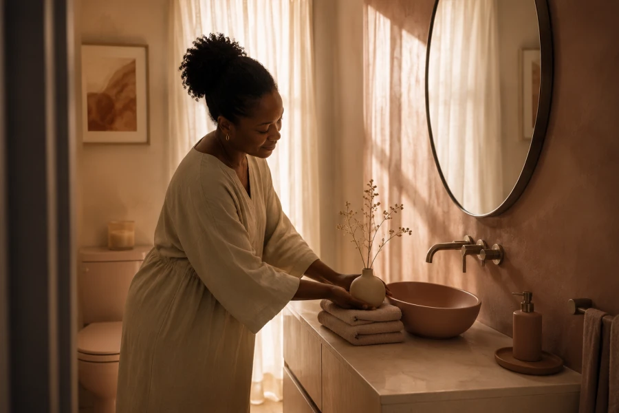
A small bathroom can feel memorable when its color story has purpose. The best small bathroom color ideas do more than make a room look larger. They set a mood that supports everyday rituals, from rushed mornings to slow evening resets. A thoughtful palette can make simple fixtures look elevated and older finishes feel more current. The goal is not to erase the room’s size. Instead, create a sense of balance that makes every element feel considered. Start by choosing the emotional quality you want to feel when entering. Then layer color through walls, towels, art, hardware, and storage. Small adjustments often create the most meaningful transformation. A focused palette brings calm to even the busiest little bathroom.
Bathrooms are often the first room guests notice when they visit. That makes color a powerful way to create a polished impression. A soft monochromatic scheme feels seamless and serene. A sharper contrast can feel modern when used with restraint. Begin with small space color balance rather than collecting too many accents. Let one finish take the lead and allow supporting colors to stay quieter. Repeating one hue across textiles and accessories creates a pleasing rhythm. Even a small powder room can feel layered with the right tonal shifts. Avoid introducing too many competing patterns at once. A clear visual direction always feels more spacious than visual clutter.
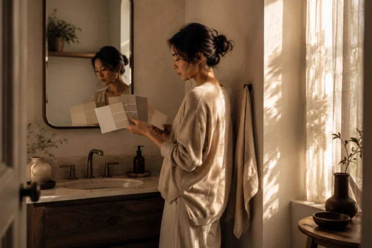
Color becomes easier to select once you define the room’s desired atmosphere. A spa-like bathroom may call for misty greens, softened stone, and creamy white. A cheerful bathroom may welcome peach, buttery yellow, or pale sky blue. A dramatic powder room can hold richer navy, plum, or charcoal. Explore powder room paint choices that suit the room’s use rather than copying a trend. Guest bathrooms can carry more personality than shared family spaces. Daily-use bathrooms often benefit from colors that feel restful over time. Think about the kind of energy you want in the morning. That answer will guide every shade that follows.
Muted colors often make compact rooms feel more forgiving and welcoming. A warm cream softens stark fixtures without looking overly traditional. Dusty rose adds warmth while remaining gentle enough for a full wall. Pale eucalyptus creates a relaxed look with white tile and natural textures. A calming bathroom palette works best when the contrast stays controlled. Use one deeper accent in a mirror frame, towel, or small rug. Keep the ceiling and trim in a related lighter tone. That tonal connection allows the room to feel layered without feeling crowded. A quieter palette can also make daily cleaning feel less visually demanding. Comfort often comes from reducing unnecessary visual noise.
Contrast can bring life to a small bathroom without making it feel busy. Pairing pale walls with dark hardware adds definition and depth. A darker vanity against warm white walls can anchor the room beautifully. The trick is avoiding contrast on every surface. Give the eye one clear moment of drama, then let the rest recede. Consider low-light bathroom paint if your room lacks a window but still needs character. Softer darks, such as charcoal-blue or mossy green, often feel more inviting than pure black. Balance them with reflective mirrors and lighter textiles. The result feels intentional rather than heavy. Contrast should create depth, not visual pressure.
A long-lasting palette gives you room to refresh the bathroom gradually. Choose wall colors that can support changing towels, artwork, and storage baskets. Neutral does not have to mean plain or colorless. Warm taupe, foggy blue, putty green, and creamy almond all feel distinctive. Select a shade that still looks good beside both bright white and natural textures. This gives you flexibility when your style evolves. Seasonal accents can add variety without requiring a new paint job. Consider natural materials for contrast, including wood, woven fibers, and ceramic. They bring texture without introducing another strong color. A versatile foundation keeps the room from feeling dated too quickly.
The final layer should make the bathroom feel connected to the rest of your home. Add a framed print, a colored glass vessel, or a textured bath mat. Keep the scale of accessories appropriate for the room. One meaningful object is usually stronger than several small decorative pieces. Use open surfaces carefully so the palette remains visible. A few coordinated details can make a modest bathroom feel surprisingly refined. Allow practical items to blend into the color story whenever possible. Refillable containers and matching towels create visual continuity. Your palette should work with your habits rather than demand constant upkeep. When color supports both beauty and function, the room becomes much easier to enjoy.

Leave a comment