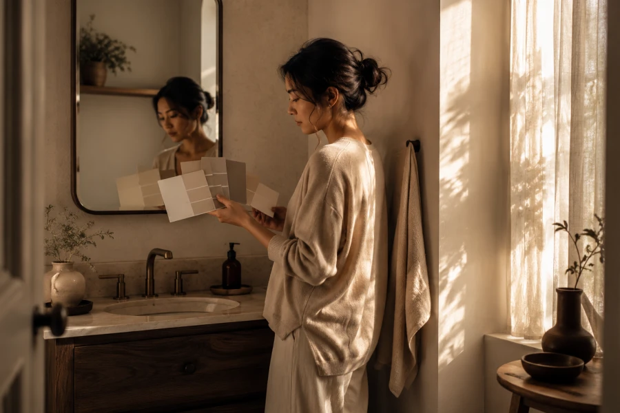
A compact bathroom rarely feels generous on paper. Yet its atmosphere changes quickly once paint interacts with daylight, tile, and mirrors. Choosing paint colors for small bathrooms begins with noticing what the room already reflects. A soft wall tone can make the ceiling feel higher and the vanity look lighter. By contrast, an untested shade may absorb light and make simple routines feel cramped. The most successful choices coordinate surfaces rather than chase a passing trend. Start with the fixture finish, grout color, and natural light available throughout the day. Then decide whether you want a clean, cocooning, or quietly dramatic mood. Sample boards make these decisions easier because color shifts after sunset. That small amount of preparation prevents expensive repainting later.
Scale is not only about square footage in a bathroom. It is also about contrast, shadow, and where the eye naturally lands. Pale finishes tend to create breathing room when surfaces already feel visually busy. A deeper shade can still work beautifully when it supports a clear focal point. The key is choosing light-reflecting wall colors that flatter the room instead of fighting it. Look closely at the largest permanent surface before selecting a direction. A white sink, warm flooring, or dark framed mirror will influence the result. One balanced color choice can make the entire room feel more intentional. Keep your first decision simple and let the smaller accents follow. A calm foundation gives towels, storage, and decor more room to shine.
Natural light changes more dramatically in bathrooms than many homeowners expect. A window facing north can cool a color throughout the day. Warm bulbs can make a muted green suddenly appear too yellow at night. Test swatches on several walls instead of relying on one small patch. Observe them in the morning, afternoon, and after your regular evening routine. This habit supports a stronger compact bath design because the room will feel consistent at every hour. Glossy tile also reflects color back onto nearby walls. That reflected cast can make neutral paint look surprisingly pink, blue, or gray. Consider the room’s artificial lighting before buying a full gallon. A thoughtful test phase saves the bathroom from looking different than you imagined.
Soft blue-gray, misty green, warm ivory, and dusty blush all create different visual effects. Cool tones can gently pull walls away from the eye. Warm neutrals often make a windowless space feel more welcoming and less clinical. The smartest choice depends on the undertones already present in the room. Review bathroom paint undertones before committing to a favorite color from a screen. A beige with green undertones may clash with rosy tile. A gray with violet undertones can feel unexpectedly cold next to bright white fixtures. Keep the transition between wall, trim, and ceiling gentle. Fewer sharp visual breaks usually create a more open impression. The room will appear more polished when every surface feels connected.
Paint should support the existing finishes, not compete with them. Begin by identifying whether your fixtures read warm, cool, or neutral. Brass details often welcome earthy cream, muted clay, and soft olive shades. Chrome pairs easily with blue-gray, charcoal, crisp white, and pale lavender notes. A focused small bathroom paint palette prevents the room from feeling fragmented. Choose one wall color, one trim direction, and one accent material. Repeating a finish in two places makes even a small room feel considered. Towels and artwork can provide contrast without overwhelming the walls. Aim for visual rhythm rather than a perfectly matching set. That approach gives the space personality while protecting its sense of calm.
Trend-driven colors can be fun, but a bathroom deserves a shade you will enjoy daily. Consider how the color feels during tired mornings and quiet evenings. A muted tone often stays more versatile than a highly saturated one. You can introduce bolder personality through textiles, hardware, and small decorative pieces. This keeps future updates simple and affordable. Think about the emotional effect you want from the room. Pale sage feels restorative, warm mushroom feels grounded, and soft blue feels clean. Even a deeper shade can feel peaceful when the rest of the room stays edited. Keep open shelving minimal so the wall color has room to breathe. The result will feel personal without becoming visually exhausting.
Great bathroom color decisions come from observation rather than guesswork. Measure the light, notice the undertones, and compare samples beside permanent finishes. Bring home several options instead of forcing one shade to work. Small spaces reveal mistakes quickly, but they also reward thoughtful details. A single wall color can change how the mirror, tile, and storage appear together. Give yourself permission to choose a tone that feels welcoming rather than merely safe. Once the walls feel right, styling the rest of the room becomes much easier. The final palette should make your daily routine feel lighter and more comfortable. That is the real advantage of a well-planned color decision. Your bathroom can feel composed, useful, and quietly beautiful every day.



Leave a comment